Matching furniture colours sounds simple… until you’re actually doing it.
You find a sofa you love. Then you wonder if it works with your flooring. Then you’re unsure about the coffee table. Suddenly everything feels mismatched, and the room doesn’t look the way you imagined.
The good news? You don’t need to be an interior designer to get it right.
Colour matching isn’t about strict rules. It’s about balance, contrast, and knowing when to stop.
Here’s how to approach it with confidence.
Start With What You Can’t Change
Before choosing any furniture, look at the fixed elements in your room.
- Flooring
- Wall colour
- Built-in wardrobes
- Kitchen cabinets (in open-plan spaces)
These already set the tone.
For example:
- Warm-toned wood flooring pairs better with warm beiges, creams, and earthy browns.
- Cool grey flooring works beautifully with cooler neutrals, charcoal, navy, or muted tones.
Instead of fighting what’s already there, work with it.
Choose a Base Colour First
Every well-designed room has a dominant colour. That’s your anchor.
Usually, it’s:
- The sofa
- The bed
- The dining table
- Or a large rug
Pick one main piece and let everything else support it.
Trying to choose everything at once is where most people go wrong.
Follow the 60–30–10 Rule (But Keep It Relaxed)
Designers often use the 60–30–10 approach:
- 60% – dominant colour (walls or large furniture)
- 30% – secondary colour (chairs, cabinets, curtains)
- 10% – accent colour (cushions, décor, art)
You don’t need to measure percentages exactly — just make sure one colour leads, another supports, and one adds contrast.
Too many equal colours create visual chaos.
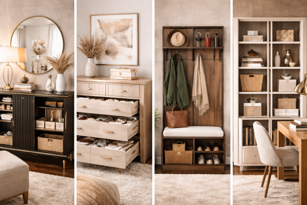
Don’t Be Afraid to Mix Woods
A common myth is that all wood finishes must match perfectly.
They don’t.
The key is undertone.
- Warm woods (oak, walnut, honey tones) mix well together.
- Cool woods (ash, grey-toned finishes) blend better with similar undertones.
What looks wrong is mixing warm orange wood with cool grey wood without balance.
If you’re unsure, add a neutral rug between pieces. It softens the contrast.
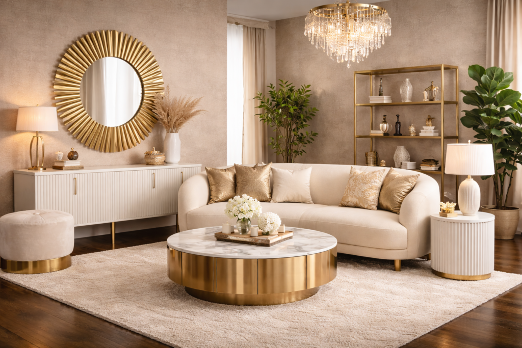
Neutrals Are Your Safety Net
If you’re worried about clashing colours, neutrals make everything easier.
Beige, cream, soft grey, taupe — these tones blend effortlessly with most palettes.
For example:
- A beige sofa works with dark wood, light wood, black accents, or even bold cushions.
- A grey bed frame can support almost any bedding colour.
When in doubt, keep large furniture neutral and add personality through smaller accents.
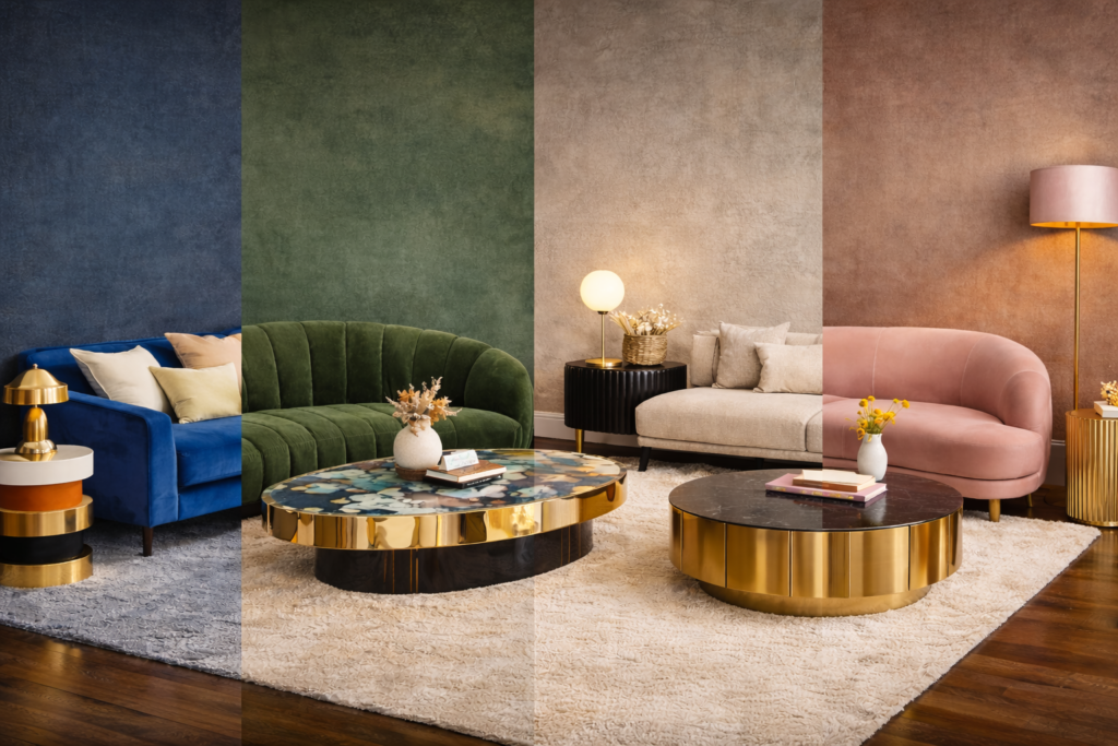
Add Contrast Intentionally
Rooms look flat when everything is the same shade.
If your sofa is light, consider:
- A darker coffee table
- A contrasting rug
- Deeper accent cushions
If your furniture is dark:
- Add lighter textiles
- Use mirrors
- Keep walls brighter
Contrast adds depth. Depth feels premium.
Think in Tones, Not Exact Colours
Instead of trying to match “beige with beige,” think warm vs cool.
Two different shades of beige can look completely different if one is warm and one is grey-toned.
When shopping, compare items side by side (or at least check product images carefully). If undertones clash, the room won’t feel cohesive.
Keep It Consistent Throughout the Room
This is where the “professional” look really happens.
Repeating a colour at least twice makes the space feel intentional.
For example:
- If you have black table legs, repeat black in a lamp or picture frame.
- If you introduce navy cushions, echo navy in artwork or a rug pattern.
Repetition creates harmony.
Avoid These Common Mistakes
A few things that often throw off a room:
- Matching everything too perfectly (it looks flat)
- Mixing too many bold colours
- Ignoring undertones
- Forgetting about flooring colour
- Choosing trendy colours that don’t suit your space
The goal isn’t perfection. It’s balance.
When in Doubt, Keep It Simple
If you want a safe, timeless combination that rarely fails:
- Neutral sofa
- Wooden table
- Soft rug
- One bold accent colour
That’s it.
You can always layer more later, but starting simple keeps the space elegant.
Final Thought
Matching furniture colours like a pro isn’t about memorising design rules.
It’s about creating a space that feels calm and intentional.
Choose a base.
Add contrast thoughtfully.
Repeat tones.
Keep clutter low.
When everything works together instead of competing for attention, your home instantly feels more polished — and a lot more expensive.